Design Principles
Five emphasized in class
-
-
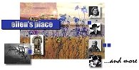
Ellen’s Place
is a graphic artist’s inspiring, well-designed site that includes interesting biographies about famous people, plus tons of links to other useful sites. It's a pleasure to browse.
-
- Alignment – line up things . . . in some way
- Proximity – related parts and info go together
- Contrast – so important information stands out
- Repetition – repeated parts and patterns
- Unity – all the parts add to the whole piece
Source for the following information and examples: The Non-Designer’s Design Book by Robin Williams
-
Alignment,
Proximity,
Contrast, and
Unity applied in a simple business card.
![[James Monroe Business Cards]](./img/james_monroe.gif)
- Left Alignment
- Center Alignment
- Right Alignment
- Name and title together (in proximity), as well as address and phone number together
- Size & style of name contrasts with other text, making the name stand out clearly
- The equal gutter (white space) all around, and the use of only one font, adds to the design’s unity
-
Alignment and center alignment on all the invitations,
but by simply changing the text field’s position on the card, a strong design appears; and the application of
contrast in the last card (white text on black field) makes
the strongest design.
![[Please Come invitations]](./img/please_come.gif)