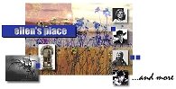
is a graphic artist’s inspiring, well-designed site that includes interesting biographies about famous people, plus tons of links to other useful sites. It's a pleasure to browse.
- Alignment – line up things . . . in some way
- Proximity – related parts and info go together
- Contrast – so important information stands out
- Repetition – repeated parts and patterns
- Unity – all the parts add to the whole piece
![[James Monroe Business Cards]](./img/james_monroe.gif)
![[Please Come invitations]](./img/please_come.gif)